Colors
hex: #7f2320
class:
bg-red-100
fg-red-100
hex: #9c1f1e
class:
bg-red-80
fg-red-80
hex: #e1141d
class:
bg-red-60
fg-red-60
hex:#F9D0D2
class:
bg-red-40
fg-red-40
hex:#FCE7E8
class:
bg-red-20
fg-red-20
hex: #000000
class:
bg-black-100
fg-black-100
hex: #333333
class:
bg-black-80
fg-black-80
hex: #666666
class:
bg-black-60
fg-black-60
hex: #999999
class:
bg-black-40
fg-black-40
hex: #CCCCCC
class:
bg-black-20
fg-black-20
hex: #787a7a
class:
bg-grey-100
fg-grey-100
hex: #939595
class:
bg-grey-80
fg-grey-80
hex: #a5a9a9
class:
bg-grey-60
fg-grey-60
hex: #c9caca
class:
bg-grey-40
fg-grey-40
hex: #dadede
class:
bg-grey-20
fg-grey-20
hex: #baa488
class:
bg-beige-100
fg-beige-100
hex: #c8b6a0
class:
bg-beige-80
fg-beige-80
hex: #d7ccbd
class:
bg-beige-60
fg-beige-60
hex: #e3dbcf
class:
bg-beige-40
fg-beige-40
hex: #f8f5f3
class:
bg-beige-20
fg-beige-20
hex: #dbae29
class:
bg-mustard-100
fg-mustard-100
hex: #e2be54
class:
bg-mustard-80
fg-mustard-80
hex: #ebd186
class:
bg-mustard-60
fg-mustard-60
hex: #f1dfa9
class:
bg-mustard-40
fg-mustard-40
hex: #f9f2dc
class:
bg-mustard-20
fg-mustard-20
hex: #8200df
class:
bg-purple-100
fg-purple-100
hex: #9b33e5
class:
bg-purple-80
fg-purple-80
hex: #ba83eb
class:
bg-purple-60
fg-purple-60
hex: #cd99f2
class:
bg-purple-40
fg-purple-40
hex: #f2e7fb
class:
bg-purple-20
fg-purple-20
hex: #00467b
class:
bg-navy-100
fg-navy-100
hex: #336b95
class:
bg-navy-80
fg-navy-80
hex: #7e9eb7
class:
bg-navy-60
fg-navy-60
hex: #cbd8e2
class:
bg-navy-40
fg-navy-40
hex: #e6ecf1
class:
bg-navy-20
fg-navy-20
Fonts
By default the font Arial is used in the color #6D6F6F (specifically selected for color blindness), at 16 pixels (line height 1.5). All headers are in Apax, color #333333. Links are blue (#0650D0), with hover color #6A96E3 (80% of link color). Titles can have one section highlighted by surrounding it with a span tag.
Font desktop:
H1 header
Apax Medium - 48px / 60px (line height)
H2 header
Apax Regular - 36px / 44px (line height)
H3 header
Apax Regular - 24px / 30px (line height)
H4 header
Apax Regular - 20px / 24px (line height)
Font tablet:
H1 header
Apax Regular - 36px / 43.2px (line height)
H2 header
Apax Regular - 28px / 33.6px (line height)
H3 header
Apax Regular - 22px / 26.4px (line height)
H4 header
Apax Regular - 18px / 21.6px (line height)
Font mobile:
H1 header
Apax Medium - 28px / 33.6px (line height)
H2 header
Apax Regular - 24px / 28.8px (line height)
H3 header
Apax Regular - 20px / 24px (line height)
H4 header
Apax Regular - 16px / 19.2px (line height)
Design rules
Backbone
- Start the page with a white backbone in the header section of the page, or no backbone at all.
- The first backbone you use after the header should always be red.
- The backbone can only be added in the center of the page.
- Except for the backbone included in a form, the backbone must always have a width of 30px
- The mobile width of the backbone should always be 10px and aligned to the left of the screen
- The backbone can be devided by an image, coloured block or whitespace. The seperate parts of the backbone can't contain more then 3 colours.
Usage of colors
General:
No other colors can be used except the colors that are defined at the Colors section.
Font colors:
No other colors can be used except the color that is defined at Fonts section.
Background colors:
Except for the darkest Navy color (bg-navy-100), only the lightest colors can be used as background colors (See the classes that end with 20 at the Colors section).
CTA colors:
No other colors can be used except the colors that are defined at Colors section.
Doodles
Doodles can only be used in combination with an image. The doodle must support the image, not the other way around (i.e. the doodle must nog be bigger than the image).
Images
General
Images can be found on images.exact.com. Make sure you always use image compression before using the image on the website:
- Always resize the image to the size you need on the page. Avoid using big images if this is not needed.
- If you don't have the software (like Adobe Photoshop) to compress the image, see this page for free image compression sites.
Header images
It is not mandatory to add a doodle in the header of a landingpage. When using an image without a doodle, we prefer that you use an image that is (partly) cut out. If this isn't possible, you can also just add an image with a background.
It is not neccesary to use a doodle image in campaigns and landingpages. To keep consistency, you can use a header image without a doodle if this isn't used in the campaign.
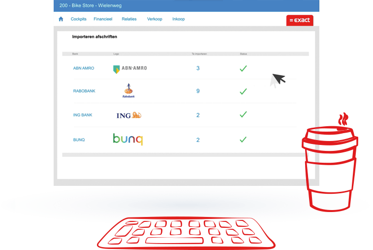
Sticky image
- When using a doodle on the images in the 'sticky image' addon, make sure you always use the same doodle in each image.
- When using an image like the example below, only the doodle of the coffee cup can be replaced by another doodle. The keyboard must always be used.
Video's
When using a video always show the video in a pop-up (See modal popup addon).
Forms
When using a form in combination with a backbone, the backbone can only have a width of 20px instead of the default width of 30px.
Website rules
Publishing
Webpage
A webpage must meet the following requirements before it can be put live:
- The copy is aligned with all stakeholders
- Solution marketing is involved and updated regarding product related pages
- The right tone of voice is used
- The page in pagebuilder uses the correct naming convention
- The page in pagebuilder is linked to the right category and language
- The design rules and VI are applied correctly
- The page is responsive and ready for mobile
- All images used on the page are compressed and have the right size
- When using small images avoid uploading it in a big sizes
- Images can be compressed via Photoshop or see this page for free image compression sites..
- The AMP page contains no errors when using the validator
- The AMP page will be created once the menu-item for the page is created
- The AMP page uses the same URL, with /amp inserted right after the language tag or the root in case of the global site
- The meta data and OG tags are filled in via the SEO tab in the menu-item
- The data for the datalayer is filled in correctly
- Changes to a page won't conflict with experiments running on this page
Forms
- When creating a new form the Master form must be used to duplicate to make sure all required fields and settings are used.
- The correct naming convention is used for the title of the form
- The data is saved in the right systems
- When sending an e-mail via the website
- The content and variables in the e-mail are checked
- The subject of the e-mail is checked
- The sender's e-mailaddress is checked
- The website is able to send the user- and/or admin e-mail
- The design rules and VI are applied correctly in the e-mai
- The data for the datalayer is filled in correctly
- A thank you page or message is created
Raw HTML, Scripts & Stylesheets
- If possible avoid using raw HTML, Scripts & Styling because this affects the page speed and performance.
- When extra scripts & stylesheets are needed always include this at the bottom of the page via the scripts snippet.
Testing & Experiments
A/B tests
- Before the test starts a hypothesis should be created in the testing document.
- A test page uses the correct naming convention.
- The test in optimize uses the correct naming convention.
- When the test is finished, the test page in pagebuilder and the menu-item are being deleted a.s.a.p.
- Results of the tests are being updated in the testing document.
Personalization
- Before the experiment starts a hypothesis should be created in this document.
- The experiment in optimize uses the correct naming convention.
- When the experiment is finished the results are being updated in this document.
Datalayer
Data that can be pushed to the datalayer can be found in the SDD document. When you create new or change existing values that need to be pushed, this always needs to be updated in the SDD document. For more information, contact the Marketing Automation team.
General
The general page data kan be maintained at the menu-item of the page (Menu item > SEO Score > Datalayer). The datalayer can't be added to the AMP pages.
The following data is automatically generated but can be changed manually
- Page title {pagetitle}
- Language {language}
- Breadcrumbs {breadcrumbs}
Other data is optional but not less important to consider adding it to the page. This data can be added manually. When in doubt about what info you must enter please contact the Marketing Automation team.
Buttons
When you want to push an event to the Datalayer via a button, you can add the following line to the "onclick" of the button add-on:
javascript:global_layer.push({'event': 'e_cta','dL_ctaAction': 'My button'});
Replace the text "My button" with the value you want to push to the Datalayer.
When you look at the source code, an example of a trial button may look like the this:
<a href="/try-now" class="btn btn-blue" onclick="javascript:global_layer.push({'event': 'e_cta','dL_ctaAction': 'Try now'});">Try now</a>
Forms
You must select the form type in the add-on of the form in pagebuilder. The form in RSform must contain a PHP script to make sure the data is pushed to the Datalayer.
Only web specialists and super users have the permission to add or change this.
The following script must be added to the Script called after form has been processed section:
require_once (JPATH_SITE.'/libraries/exact/datalayerForms.php');

$params = array(
'dL_formAction' => 'submit',
'dL_action' => 'success',
'dL_formId' => $_POST['form']['formId'],
'dL_packageCode' => $_POST['form']['PackageCode'],
'dL_formType' => $_POST['form']['formType']
);
$thankYouMessage = $thankYouMessage . datalayerForms::processFormSubmit('e_formSubmit', $params, $_POST['form']['formId']);
Dynamic scripts
Script files and style sheets should be included via the script snippets to keep optimal page speed and performance. It prevents scripts and stylesheets from being included multiple times and is put at the bottom of the page.
The following snippets can be used:
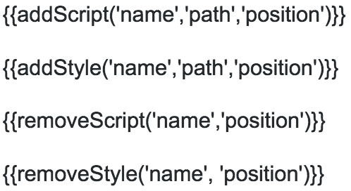
Name: Name of the script or stylesheet. Only for internal use.
Path: The URL of the script.
Position: 'top' or 'bottom'.
Scripts and stylesheets must always be included at the bottom of the page. When it is required to place the script in the head of the page, you can use the position "top".
Check this document to see what snippets are already used.
You can overwrite the stylesheet or script file by using the names that are already in use.
Classes
| Class | Description |
|---|---|
Header |
|
| header | The header section of the page must contain this class to add the multple background colors. Use this class in combination with the lightest background color classes (ending with 20). Example: header bg-navy-20
header bg-beige-20
|
| moveto-bottom | When applied to the image addon in the header, the image will overlap the section that follows at the bottom of the header |
| moveto-left | When applied to the image addon in the header, the image will be placed a bit more to the left |
| moveto-right | When applied to the image addon in the header, the image will be placed a bit more to the right |
| moveto-top | When applied to the image addon in the header, the image will be placed a bit more to the top |
Content alignment |
|
| force-left | All text elements inside this section will be aligned to the left. Regardless of the settings. |
| force-right | All text elements inside this section will be aligned to the right. Regardless of the settings. |
| text-left | The first child elements inside this section will have its text aligned to the left. |
| text-right | The first child elements inside this section will have its text aligned to the right. |
| text-center | The first child elements inside this section will have its text aligned to the center. |
Mobile |
|
| flip-order-xs | Flip the order of the information on mobile screen sizes. When your section is divided into 2 columns, the first column wil appear after the second column on mobile. |
| flip-order-sm | Flip the order of the information on tablet screen sizes. When your section is divided into 2 columns, the first column wil appear after the second column on a tablet. |
Other |
|
| background-full-height | set to column with background image to completely use the full height with the background. |
| sticky | Set an element to sticky when it comes into view. Has an top offset of 100pixels to account for the fixed menu |
| bbs | Backbone slider: this will animate the backbone to swipe over a video or image. Set to the column in which the video or image is placed. Other classes are needed to have it function correctly:
|
| nav-sub | Use this class to create the sub navigation used on the product pages. This will fix the navigation to the top of the page as soon as you scroll down past it and it will remove at that point the main menu. Place this class on the row the menu is in. The sub navigation itself consists typically of a heading and a button group in a 2 column structure. |
| form-validation | Add this class to the form tag (RsForm - attributes - CSS class) to enable form validation for your form. |
| visual-full-width | The image will cover the full width of it's section or column on every screen size. |
| split-bg | Divide a section in 2 different background colors (50/50). The split background can only be used on desktop and contains a white background in combination with only the lightest background colors. Use this class in combination with the following classes:
Examples: Classes used: Classes used: |
| full-width | For the most optimal alignment on mobile this class can be applied to a row / sectionto contain the full wildth of the screen. When the row / section has a background color, the following class must be added: bg-color |
| hyphenate | Use on really long words that break the flow in a small column: this will break the word on a logical place and add a hyphen. |
| pageLength | Add this class to the sub menu row to create a page length indicator. |
| list-checkmark | Add this class to an unordered list to use checkmarks as bullits |
Add-ons
Only use the add-ons with the category "Exact"